This morning, I started a local backup. Moments later, I started an online backup. I was greeted with this dialog:
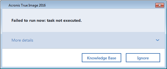
Looks a little sparse. Unhelpful. But there is that “More details” drop-down to click on. Let’s do that.
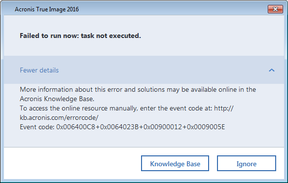
Ah. Well, that’s more information. But it’s confusing and unhelpful, but I suppose it holds the promise of something more helpful to come. I notice that there’s a URL, but that it’s not a clickable link. I notice that if the dialog means what it says, I should copy those error codes and be ready to paste them into the page that comes up. I can also infer that there’s not local help for these error codes. Well, let’s click on the Knowledge Base button.
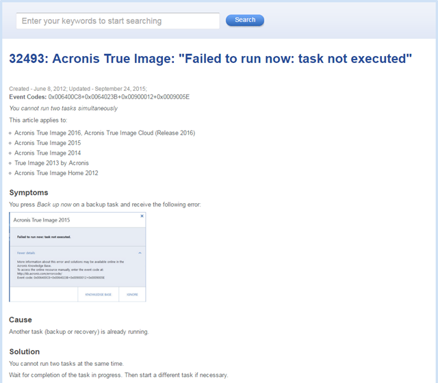
Oh. The issue is that another backup is running, and starting a second one is not allowed.
As a tester, I wonder how this was tested.
Was an automated check programmed to start a backup, start a second backup, and then query to see if a dialog appeared with the words “Failed to run now: task not executed” in it? If so, the behaviour is as expected, and the check passed.
Was an automated check programmed to start a backup, start a second backup, and then check for any old dialog to appear? If so, the behaviour is as expected, and the check passed.
Was a test script given to a tester that included the instruction to start a backup, start a second backup, and then check for a dialog to appear, including the words “Failed to run now: task not executed”? Or any old dialog that hinted at something? If so, the behaviour is as expected, and the “manual” test passed.
Here’s what that first dialog could have said: “A backup is in progress. Please wait for that backup to complete before starting another.”
At this company, what is the basic premise for testing? When testing is designed, and when results are interpreted, is the focus on confirming that the product “works as expected”? If so, and if the expectations above are met, no bug will be noticed. To me, this illustrates the basic bankruptcy of testing to confirm expectations; to “make sure the tests all pass”; to show that the product “meets requirements”. “Meets requirements”, in practice, is typically taken to mean “is consistent with statements in a requirements document, however misbegotten those statements might be”.
Instead of confirmation, “pass or fail”, “meets the requirements (documents)” or “as expected”, let’s test from the perspective of two questions: “Is there a problem here?” and “Are we okay with this?” As we do so, let’s look at some of the observations that we might make were and questions we might ask. (Notice that I’m doing this without reference to a specification or requirements document.)
Upon starting a local backup and then attempting to start an online backup, I observe this dialog.

I am surprised by the dialog. My surprise is an oracle, a means by which I might recognize a problem. Why am I surprised? Is there a problem here?
I had a desire to create a local backup and an online backup at the same time. On a multi-tasking, multi-threaded operating system, that desire seems reasonable to me, and I’m surprised that it didn’t happen.
Inconsistency with reasonable user desire is an oracle principle, linked to quality criteria that might include capability, usability, performance, and charisma. The product apparently fails to fulfill quality criteria that, in my opinion, a reasonable user might have. Of course, as a tester, I don’t run the project. So I must ask the designer, or the developer, or the product manager: Are we okay with this?
This might be exactly the dialog that has been programmed to appear under this condition—whatever the condition is. I don’t know that condition, though, because the dialog doesn’t tell me anything specific about the problem that the software is having with fulfilling my desire. So I’m somewhat frustrated, and confused. Is there a problem here?
I can’t explain or even understand what’s going on, other than the fact that my desire has been thwarted. My oracle—pointing to a problem—is inconsistency with explainability, in addition to inconsistency with my desires. So I’m seeing a potential problem not only with the product’s behaviour, but also in the dialog. Are we okay with this?
Maybe more information will clear that up.

Still nothing more useful here. All I see is a bunch of error codes; no further explanation of why the product won’t do what I want. I remain frustrated, and even more confused than before. In fact, I’m getting annoyed. Is there a problem here?
One key purpose of a dialog is to provide a user with useful information, and the product seems inconsistent with that (the inconsistency-with-purpose oracle). Are these codes correct? Maybe these error codes are wildly wrong. If they are, that would be a problem too. If that’s the case, I don’t have a spec available, so that’s a problem I’m simply going to miss. Are we okay with that?
I have to accept that, as a human being, there are some problems I’m going to miss—although, if I were testing this in-house, there are things I could do to address the gaps in my knowledge and awareness. I could note the codes and ask the developer about them; or I could ask for a table of the available codes. (Oh… no one has collected a comprehensive listing of the error codes; they’re just scattered through the product’s source code. Are we okay with this?)
Back to the dialog. Maybe those error codes are precisely correct, but they’re not helping me. Are we okay with this?
All right, so there’s that Knowledge Base button. Let’s try it. When I click on the button, this appears:

Let’s look at this in detail. I observe the title: 32493: Acronis True Image: “Failed to run now: task not executed.” That’s consistent with the message that was in the dialog. I notice the dates; something like this has been appeared in the knowledgebase for a while. In that sense, it seems that the product is consistent with its history, but is that a desirable consistency? Is there a problem here?
The error codes being displayed on this Web page seem consistent with the error codes in the dialog, so if there’s a problem with that, I don’t see it. Then I notice the line that says “You cannot run two tasks simultaneously.” Reading down over a long list of products, and through the symptoms, I observe that the product is not intended to perform two tasks simultaneously. The workaround is to wait until the first task is done; then start the second one. In that sense, the product indeed “works as expected”. And yet…are we okay with this?
Once again, it seems to me that attempting to start a second task could be a reasonable user desire. The product doesn’t support that, but maybe we’re okay with that. Yet is there a problem here?
The product displays a terse, cryptic error message that confuses and annoys the user without fulfilling its apparent intended purpose to inform the user of something. The product sends the user to the Web (not even to a local Help file!) to find that the issue is an ordinary, easily anticipated limitation of the program. It does look kind of amateurish to deal with this situation in this convoluted way, instead of simply putting the relevant information in the initial dialog. Is there a problem here?
I believe that this behaviour is inconsistent with an image that the company might reasonably want to project. The behaviour is also inconsistent with the quality criteria we call usability and charisma. A usable product is one that behaves in a way that allows the user to accomplish a task (including dealing with the product’s limitations) quickly and smoothly. A charismatic product is one that does its thing in an elegant way; that engages the user instead of irritating the user; that doesn’t make the development group look silly; that doesn’t prompt a blog post from a customer highlighting the silliness.
So here’s my bug report. Note that I don’t mention expectations, but I do talk about desires, and I cite two oracles. The title is “Unhelpful dialog inconsistent with purpose.” The body would say “Upon attempting to start a second backup while one is in progress, a dialog appears saying ‘Failed to run now: task not executed.’ While technically correct, this message seems inconsistent with the purpose of informing the user that we can’t perform two backup tasks at once. The user is then sent to the (online) knowledge base to find this out. This also seems inconsistent with the product’s image of giving the user a seamless, reliable experience. Is all this desired behaviour?”
Finally: it could be that the testers discovered all of these problems, and laid them out for the the product’s designers, developers, and managers, just as I’ve done here. And maybe the reports were dismissed because the product works “as expected”. But “as expected” doesn’t mean “no problem”. If I can’t trust a backup product to post a simple, helpful dialog, can I really trust it to back up my data?
Regular reader here – imagine my surprise when I see my own company featured! While I don’t work on this particular product so I can’t provide any information on this issue, I have forwarded your feedback to support.
Michael replies: Thanks for responding. I’d like to suggest gently that the message may well stop at support; this isn’t really a support problem per se. I believe the issues here rest with product management, developers, and testers.
I have to say a really great example of the actual testing that should be going on in a tester’s head while interacting with a product. It’s all you described in your previous blog posts. I especially like how you highlighted your bug report and how you wrote it – no structured template like way, but using full sentences, story like way, to describe what you see, which I believe should always be the case.
Anyway even tough for some (from testers, developers, to managers, or product owners) this may not be a severe issue enough to even bother with (it’s funny how often I hear people say to not bother with details), that they will be dealt with in future, but that future never comes… But as users we care about the details.
[…] to be more successful in catching issues; be prepared to use different models; be prepared to use heuristics and oracles to help them know whether there might be a problem. A tester might or might not use tools to help […]
EFFING brilliant post MB. Loved it. The way you laid this all out step-by-step is awesome. Some very good lessons for testers (and other roles) of all experience levels here.
[…] The resulting lack of testing time often means that I’m forced to operate on a ‘works as expected’ basis. There probably won’t be any opportunity to scrutinise requirements, play around with […]
Ah! That’s why the button ‘ignore’ in the first place. Maybe this issue was reported before and it was resolved (rejected) by renaming this button from OK/cancel to ‘ignore’.