On July 23, 2002, Capers Jones, Chief Scientist Emeritus of a company called Software Productivity Research gave a presentation called “SOFTWARE QUALITY IN 2002: A SURVEY OF THE STATE OF THE ART”. In this presentation, he shows data on a slide titled “U.S. Averages for Software Quality”.

(Source: http://bit.ly/1rj19Ol, accessed September 5, 2014)
It is not clear what “defect potentials” means. A slide preceding this one says defect potentials are (or include) “requirements errors, design errors, code errors, document errors, bad fix errors, test plan errors, and test case errors.”
There no description in the presentation of the link between these categories and the numbers in the “Defect Potential” column. Yes, the numbers are expressed in terms of “defects per function point”, but where did the numbers for these “potentials” come from?
In order to investigate this question, I spent just over a hundred dollars to purchase three books by Mr. Jones: Applied Software Measurement (Second Edition) (1997) [ASM2]; Applied Software Measurement: Asssuring Productivity and Quality (Third Edition), 2008 [ASM3]; and The Economics of Software Quality (co-authored with Olivier Bonsignour) (2011). In [ASM2], he says
The “defect potential” of an application is the sum of all defects found during development and out into the field when the application is used by clients and customers. The kinds of defects that comprise the defect potential include five categories:
- Requirements defects
- Design defects
- Source code defects
- User documentation defects
- “Bad fixes” or secondary defects found in repairs in prior defects
The information in this book is derived from observations of software projects that utilized formal design and code inspections plus full multistage testing activities. Obviously the companies also had formal and accurate defect tracking tools available.
Shortly afterwards, Mr. Jones says:
Note that this kind of data is clearly biased, since very few companies actually track life-cycle defect rates with the kind of precision needed to ensure really good data on this subject.
That’s not surprising, and it’s not the only problem. What are the biases? How might they affect the data? Which companies were included, and which were not? Did each company have the same classification scheme for assigning defects to categories? How can this information be generalized to other companies and projects?
More importantly, what is a defect? When does a coding defect become a defect (when the programmer types a variable name in error?) and when might it suddenly stop becoming a defect (when the programmer hits the backspace key three seconds later?)? Does the defect get counted as a defect in that case?
What is the model or theory that associates the number 1.25 in the slide above with the potential for defects in design? The text suggests that “defect potentials” refers to defects found—but that’s not a potential, that’s an outcome.
In Applied Software Measurement, Third Edition, things change a little:
The term “defect potential” refers to the probable number of defects found in five sources: requirements, design, source code, user documents, and bad fixes… The data on defect potentials comes from companies that actually have lifecycle quality measures. Only a few leading companies have this kind of data, and they are among the top-ranked companies in overall quality: IBM, Motorola, AT&T, and the like.
Note the change: there’s been a shift from the number of defects found to the probable number of defects found. But surely defects were either found or they weren’t; how can they be “probably found”? Perhaps this is a projection of defects to be found—but what is the projection based on? The text does not make this clear. And the question has still been begged: What is the model or theory that associates the number 1.25 in the slide above with the potential for defects in design?
These are questions of construct validity, about which I’ve written before. And there are many questions that one could ask about the way the data has been gathered, controlled, aggregated, normalized, and validated. But there’s something more troubling at work here.
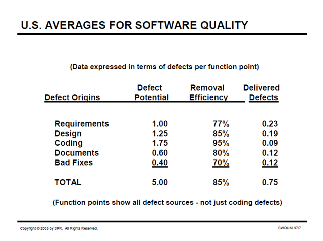
Here’s a similar slide from a presentation in 2005:
(Source: http://twin-spin.cs.umn.edu/sites/twin-spin.cs.umn.edu/files/SQA05l.pdf, accessed September 5, 2014)
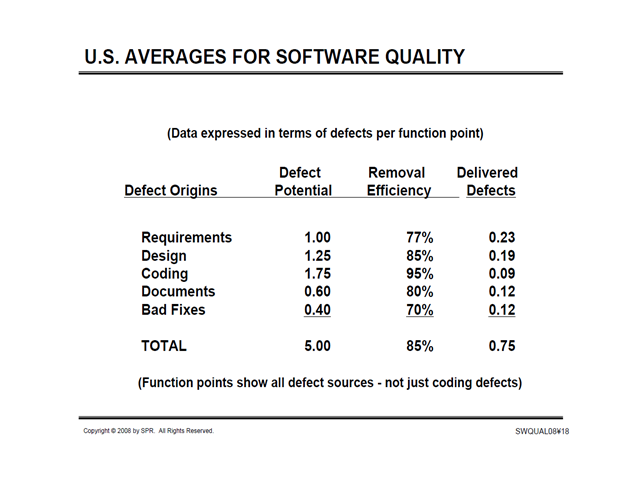
From a presentation in 2008:
(Source: http://www.jasst.jp/archives/jasst08e/pdf/A1.pdf, accessed September 5, 2014)
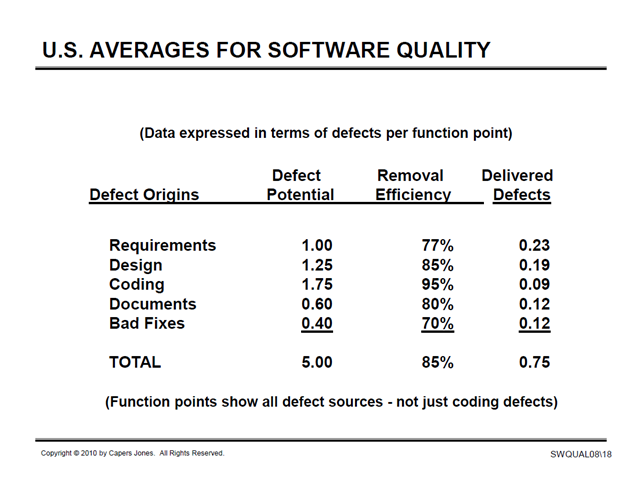
From a presentation in 2010:
(Source: http://www.sqgne.org/presentations/2010-11/Jones-Nov-2010.pdf, accessed September 5, 2014)
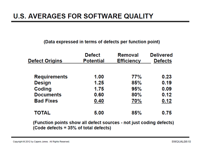
From a presentation in 2012:
(Source: http://sqgne.org/presentations/2012-13/Jones-Sep-2012.pdf, accessed September 5, 2014)
From a presentation in 2013:
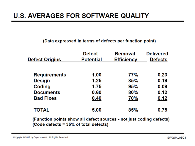
(Source: http://namcookanalytics.com/wp-content/uploads/2013/10/SQA2013Long.pdf, accessed September 5, 2014)
And here’s one from all the way back in 2000:
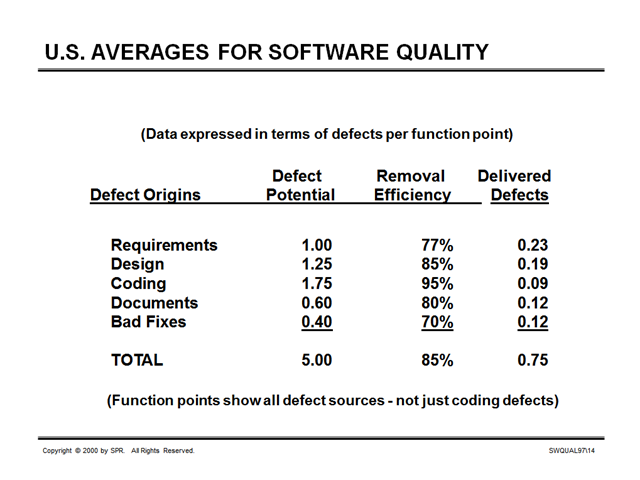
(Source: http://www.ifpug.org/Conference%20Proceedings/IFPUG-2000/IFPUG2000-14-Jones-Function_Points_And_Software_Value.pdf, accessed October 22, 2014)
What explains the stubborn consistency, over 13 years, of every single data point in this table?
I thank Laurent Bossavit for his inspiration and assistance in exploring this data.
Thank you Michael for the this dissection of statistics supposedly telling about the state of our craft. I usually get the worrisome feeling that someone is pulling my leg anytime statistics are put forward without an explained basis whether at work or in the news. According to the slides you compared at the end one would be led to assume or believe that defect potentials NEVER CHANGE. That just seems very unlikely, especially since the definition of defect potential has likely changed from observed to probables over time. I think you could write around many blog posts on this topic and slide series. The material is certainly there.
Michael replies: What disturbs me most is how often numbers like this are accepted uncritically. More to come.
More importantly, what is a defect? When does a coding defect become a defect (when the programmer types a variable name in error?) and when might it suddenly stop becoming a defect (when the programmer hits the backspace key three seconds later?)?
Brilliant.
Moreover I think sum of all defects found during development and out into the field (or comparison of these numbers) includes a hidden assumption: all defects found in development would have been found in the field too. But is this really the case?
Michael replies: “So far” is very important thing to include here. I worked with a client whose upper managers were very fond of keeping defect escape ratios, where “escapes” were tracked for six months after release. Their customers were huge corporate clients who tended to be very conservative (that is, slow) about deploying updates; it was typical for that latency period to be about a year for pilot deployments and eighteen months to two years for a full roll-out, at which point the bug reports would start falling like rain. But by that time, managers and developers had moved on to other projects, and learning opportunities were lost. The testers were well aware of this, which helped them to be pretty cynical about both measurement and management.
It’s odd. The name Capers Jones had dropped right out of my mind. To me he’d morphed into “the DRE guy” and I didn’t remember his name when you mentioned him at Starwest.
DRE is a ludicrous distortion of reality, or rather an attempt to redefine reality to fit the wishes of those who want to believe development is a neat, orderly, manufacturing process.
Perhaps the thing that really riles me about the Capers Jones approach is that it is the antithesis of learning. Development should be a process of discovering what will work best in a certain context. When you discover at an early stage that something will not work then that is very valuable information. To treat that discovery as a defect is at best a time-wasting distraction, but more likely a dangerous signal to the team of the priorities of management.
I guess that Capers Jones hasn’t updated his figures because there’s no need to. If there’s no substance to them, and if they are a mere frothy confection with no relation to an underlying reality then what’s the point in fresh froth? Is the market crying out for it? If people believe what they want to believe why waste time in refreshing their delusions?
However, the lack of change in the data makes the pointlessness of the whole exercise more obvious. In spite of all the changes over the last 14 years, in the world, in the economy, in business and most of all in development practices, the figures have miraculously remained unchanged. Really? That is beyond belief.
They have probably still a 0.75 of a bug in their Excel.
Michael replies: Uh… yeah.
Hmm, ok, I can definitely agree with the questions regarding model and definition. What I don’t get is your conclusion of “stubborness of data points”. I mean, my conclusion is, that this slide was produced once and never ever updated (and the data never ever compiled again) – neither by him nor by other people.
Doesn’t that tell enough about validity and relevance?
Michael replies: These slides (not this slide; look carefully and you’ll see that footer on almost every one is different) were included in presentations whose titles seem unambiguous: SOFTWARE QUALITY IN 2002: A SURVEY OF THE STATE OF THE ART; SOFTWARE QUALITY IN 2005: A SURVEY OF THE STATE OF THE ART; SOFTWARE QUALITY IN 2008: A SURVEY OF THE STATE OF THE ART; and so forth, including 2010, 2012, and 2013. There is nothing on any of the slides to indicate that this data was taken from one particular year (and only that year); both the titles of the presentations and copyright notice on the footers present an implicit claim that the data was current for each of the years in question (with the possible exception of 2012/2013, where the footers are the same but the titles of the presentations are different). To me, “State of the Art in 20??” should mean exactly what it says. Shouldn’t it?
[…] spokesperson for the ideas you clearly support. If you claim expertise on a subject, or purport to present statistical evidence, you should expect to be asked questions and asked to provide more. If you are not willing to speak […]
A possible explanation is that the author does not intend to use accurate numbers at all, nor has particular interest in the accuracy of the numbers. That the author intends to use the trappings of pseudo-scientific language and statistics to leverage an agenda wherein the provided data afford an interpretation to an audience shaped by the interpretation given by the author/presenter whether that be accurate or otherwise.
If this explanation were the case then there’d be no need for the data in the slides to be accurate or up-to-date, only to look accurate at a glance or be convincing to the unassuming and uninformed.
That is one possible state of affairs.
Michael replies: Indeed.
I think this is important research. It doesn’t sound like Jones is doing it all that well. I look forward to your suggestions on how it could be done better.
Michael replies: Well, one good first step might be to think in terms of validating the constructs that are used in the research, and to present data in ways that don’t distort or mislead. Over the long haul, though, it seems unlikely to me that quantitative analysis of software and software development of the kind that Jones is attempting is terribly helpful. I’m hoping for a qualitative research, social-science approach; more anthropology. A couple of examples are here: http://catenary.files.wordpress.com/2010/09/reinthewild-re07.pdf; http://www.johnrooksby.org/papers/ICSE2007_martin_testing.pdf. I’ve glanced at some work by Sally Ann Freudenberg that looks promising too; it’s on my precariously tall reading list.